Ad Redesign

Principles of design, photography, typography and color can be seen in every ad. Most people don’t even realize how many factors go into creating an ad and why they are appealing to the audience. Fortunately, these are skills that anyone can acquire and use in their own work if they learn about the principles of design.

I was asked to analyze an existing ad and then use my findings to create a new, additional ad that would fit the campaign of the original and then make a slide presentation that would show what I learned and how I applied it to the new advertisement.


Target Audience Image result for converse ad

When making an advertisement, it is important to think about who you will be advertising to. This helps to determine what will be in your ad as well as what the message will be. In my analysis, I determined that the main audience would be teens to young adults and adults. I determined this because the male used in the campaign appears to be a young adult. The message “Sneakers are boring – wear sneakers” appeals to young adults and teens because who likes boring products? This shows that the company promises that wearing converse is exciting and fun rather than boring.


Design Analysis 

Photography

Photography was one of the main elements of this advertisement. It’s bold and is center focused. The colors are also an element but I will go over that later. One way you can tell a photo works is if your eye bounces all around the photo instead of in one spot. You’re supposed to avoid center-focused photos, but the background elements such as the other guy and the AC unit in the window keep it balanced and visually appealing.
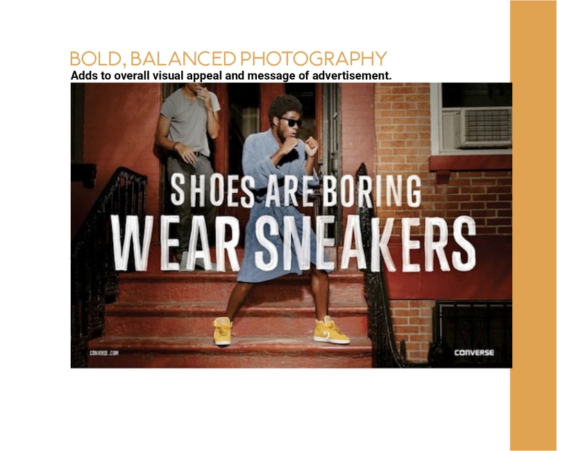
 SlideDesignFINAL3

Typography 

The font and type that was used also added to the overall visual appeal of the advertisement. The font is a sans serif type and the font mimics a painted brush design. This makes it look more exciting and not boring, which works with the overall message of the design.

SlideDesignFINAL5

Color

Color is also critical when considering your design and message. Yellow and red are analogous and complement each other. The white text adds contrast to the design. The yellow shoes could also be considered contrasting because the eye is drawn to it. The colors work together and add to the visual appeal.

SlideDesignFINAL7

Being able to analyze and determine what makes an advertisement visually appealing is important if you want to make one of your own. Target audience, design , photography, typography and color are all element of design that go into making an appealing and successful advertisement. The best part is that anyone can do it if they know what they’re looking.

The final slide presentation: SlideDesignFINAL

Photo Sources:

https://www.pexels.com/photo/street-shoes-still-converse-all-star-68814/

White Black High Top Shoes Hanging on Electric Line

http://designtaxi.com/news/357065/Converse-Ad-Shows-That-People-Who-Wear-Sneakers-Have-More-Fun/

Image result for converse ad


Is Your Ad Creative?

Advertisements are everywhere, it’s how word gets out to people. It’s a way of communicating and selling an idea to someone. So if ads are everywhere, they have to stand out to really capture attention from the audience. This is where “creative ads” come in to play. Creative ads, when done right, can make a plain product into something exciting. It can help the audience visualize what the product can do for them.

I was assigned the task of creating a creative advertisement for a boring household or office product and to use symbolic or non-literal ideas and concepts. The ad is supposed to be appealing and convincing to the target audience.


 Target Audience 

The first step is to determine a product to advertise. After that is to determine the demographics of the audience. I used a project specifics generator to determine my product, the gender, age, relationship status and media consumption of my audience. I got assigned to create an ad for an air freshener for single 18-24 year old males through a blog or magazine ad. I decided to go with the idea of a nature-scented air freshener. This appeals to most audiences, so I thought it would be appropriate for single 18-24 year old males. My ad also includes a male in the photo and he’s sitting in the comfort of his own home. This would appeal to 18-24 year old males.

CreativeAdFinal

(All images were pulled from https://www.pexels.com/)


Design 

For my design, I decided to use non-literal and symbolic ideas. Obviously there wouldn’t be real mountains and trees in your living room, but it’s the idea of it, capturing what the air freshener would smell like. I found two pictures that had similar colors so they would complement each other rather than clash or not blend well. I used photo shop to blend the two images together and to bring in the text at the bottom. I used a simple old faced type text and the color of the type is an off-white which blends and matches with colors already in the ad.

Although there are millions of advertisements out in the world, it is still possible to find a way to capture attention in a creative way. They make a plain or boring product into something exciting that people actually want to purchase or use. Knowing the essentials of design and knowing your audience is important. Take a moment to notice all the creative design and advertisements around you and why they appeal, or don’t appeal, to you.

What Makes and Ad So Great?

Let’s look at the elements of design…

poster

This is a poster advertising a pop up shop for Wellen’s Surf Shop. Wellen is an online-based surf company focused on men’s clothing. They sell their clothes in stores through third-parties. The designer of the advertisement could not be identified.

I will be breaking down the advertisement into five elements of design. This includes contrast, repetition, alignment, proximity and color.

Contrast 

contrast

First off, there is contrast in the color of the poster and the color of the font. The designer, however seems to be employing contrast in the fonts. There is a bold and a regular typeface for most used font. I have the bold font underlined in green and the regular typeface for the same font underlined in blue. The word “gentleman” adds more contrast to the ad. It is in a different font, it’s a bigger size and its placed at an angle. It allows the word to stand out against the other fonts.

Repetition

Repetition

The repetitive element in this ad is, again, the font. The designer uses the same font with both a regular and bold typeface.

Alignment 

alignment

In this ad, we can tell that the text and image is a center alignment. While center alignment is the most common and can sometimes make a design boring, it works well with the other elements of design to make it interesting to the audience. It is clearly intentional.

Proximity

Proximity

Proximity helps the viewer understand what, where and when something is happening. Highlighted in green, we understand that due to the proximity of the words there is a pop up shop for Wellen Surf Shop and it’s for gentlemen. Next, the viewer needs to know where and when the event is going to happen. This is inside the red box. While the viewer has the what, where and when, there can still be more information added to the image to let them know just a little more about what is going on. Since it’s not as vital, this information is added below everything else in smaller, regular typeface. But it’s close the rest of the information. This is displayed in the yellow box.

Color

In terms of color, this design is fairly simple. There are only a few colors on the page. It’s just different shades and tints of blue and brown.

colors2

Overall, this advertisement is good example of excellent yet simple design. The designer employs contrast through the font choices and color. Repetition is also shown through the font typeface. The words on the page are aligned centrally with the man who is in the photograph, allowing the ad to flow. The proximity of the words help the viewer know what exactly is being advertised. Lastly, the colors in the ad are simple and work well with each other. All of these principles are things to consider when looking at or creating an advertisement.